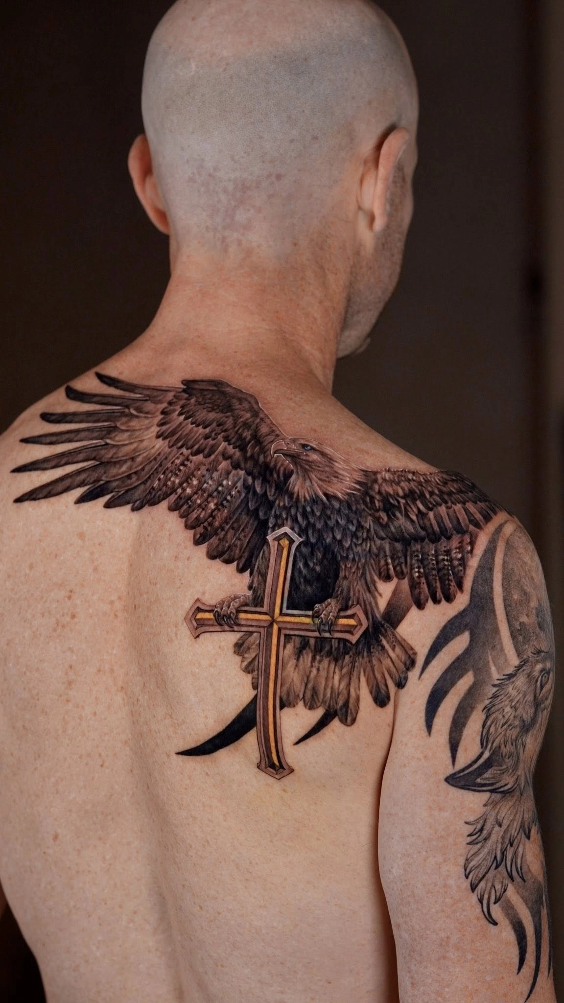
Black & Grey Realism Tattoo: The Complete Guide (2026) - Chapter 7 — Composition & Flow Designing Black & Grey Tattoos That Move with the Body



Black & Grey Realism Tattoos
Chapter 7
Composition & Flow
Designing Black & Grey Tattoos That Move with the Body
Quick Answer
A successful Black & Grey Realism tattoo is more than a collection of beautifully rendered images. It is a composition designed to work with the body's anatomy, guiding the viewer's eye naturally while maintaining balance, readability, and harmony from every angle.
Even the most technically impressive portrait can feel awkward if it ignores the natural flow of the body.
Professional realism begins with composition—not tattooing.
The Body Is Not a Flat Canvas
One of the biggest differences between painting on paper and tattooing skin is that the canvas is constantly moving.
Muscles contract.
Joints bend.
Skin stretches.
The body is viewed from multiple angles rather than a single fixed perspective.
This means a composition that looks perfect on a computer screen may lose its impact once transferred onto the body.
Professional artists therefore begin every project by studying anatomy before placing the first design element.
Artist Insight
"We don't design tattoos for photographs—we design them for people. Every composition should feel like it belongs to the body, not simply sits on top of it."
— Silver Ant Tattoo
Every Body Has Natural Lines
The human body already contains visual pathways.
The collarbone.
The spine.
The ribcage.
The forearm.
The calf.
The shoulder.
Experienced artists use these anatomical lines as guides rather than obstacles.
Instead of forcing a rectangular photograph onto curved skin, they reshape the composition so that it follows these natural contours.
The result feels effortless.
Viewers often cannot explain why the tattoo looks "right."
They simply sense that it belongs.
Leading the Eye
Every strong composition answers one important question:
Where should the viewer look first?
This primary point of attention is known as the focal point.
In Black & Grey Realism, the focal point is often:
-
a person's eyes;
-
an animal's face;
-
a dramatic highlight;
-
an important symbolic object.
Everything else should support that focal point.
Artists use several techniques to guide the eye:
-
stronger contrast;
-
sharper edges;
-
brighter highlights;
-
simplified backgrounds;
-
directional lighting.
Without a clear focal point, the viewer's attention wanders.
The tattoo may contain excellent technical work but still feel visually confusing.
Did You Know?
Professional artists often blur or simplify secondary elements on purpose.
By reducing detail in less important areas, they naturally draw the viewer's attention toward the main subject.
This principle is widely used in photography, cinema, and classical painting.
Designing Sleeves as One Artwork
One of the most common mistakes is treating a sleeve as a collection of separate tattoos.
A successful sleeve should feel like one continuous composition.
Rather than placing isolated images beside one another, artists create smooth transitions using:
-
smoke;
-
clouds;
-
abstract shadows;
-
architectural textures;
-
flowing fabric;
-
negative space.
These connecting elements create rhythm and prevent the sleeve from appearing fragmented.
Every section should contribute to the overall story.
Scientific Note
Eye-tracking research suggests that viewers naturally follow continuous lines, areas of high contrast, and directional shapes. Effective tattoo compositions use these visual pathways to control how the artwork is experienced.
Further Reading
-
National Eye Institute
-
National Library of Medicine (PubMed)
Balance Is More Important Than Symmetry
Many collectors assume a balanced tattoo must also be perfectly symmetrical.
This isn't true.
Nature itself is rarely perfectly symmetrical.
Professional compositions often balance:
-
large shapes against smaller ones;
-
dark areas against light ones;
-
detailed sections against open space.
This creates visual stability without making the tattoo appear rigid or mechanical.
Balance feels natural.
Perfect symmetry can sometimes feel artificial.
Using Negative Space to Create Flow
Negative space isn't simply empty skin.
It functions as a design element.
Strategically preserved areas of skin can:
-
separate subjects;
-
increase readability;
-
enhance lighting;
-
create breathing room;
-
improve long-term ageing.
One of the biggest differences between experienced and inexperienced realism artists is knowing when not to tattoo.
Leaving space often strengthens the composition more than filling every available area.
Artist Note
One of the most common requests we receive is:
"Can we add one more element?"
Sometimes the answer is yes.
But often the strongest improvement comes from removing something rather than adding it.
Good composition is rarely about fitting everything into one tattoo.
It's about deciding what deserves attention.
Planning for Future Projects
A tattoo rarely exists alone forever.
Many collectors eventually expand:
-
half sleeves into full sleeves;
-
chest pieces into body suits;
-
isolated portraits into larger narratives.
Experienced artists consider these possibilities from the beginning.
Even if the client has no immediate plans for expansion, leaving thoughtful transition areas makes future additions feel intentional rather than improvised.
Planning ahead creates flexibility.
Why Composition Ages Better Than Detail
Fine details naturally soften as tattoos heal and mature.
Composition remains.
Years later, viewers will still recognise:
-
the silhouette;
-
the focal point;
-
the lighting;
-
the overall movement.
These larger visual structures are what give a tattoo lasting impact.
This is why professional artists spend so much time designing before tattooing.
Strong composition survives time better than excessive detail.
Common Misconception
"A bigger tattoo simply means adding more images."
Not necessarily.
A larger tattoo should tell a larger visual story.
Expanding the size without improving composition often creates clutter rather than impact.
Scale should serve the narrative—not overwhelm it.
Key Takeaways
-
The body should be treated as a three-dimensional canvas.
-
Strong compositions guide the viewer toward a clear focal point.
-
Sleeves work best when designed as one continuous artwork.
-
Negative space improves readability, flow, and long-term ageing.
-
Great composition often has a greater impact than additional detail.
Continue Exploring
The next chapter focuses on one of the biggest decisions every collector faces:
Should you choose Black & Grey or Color Realism?
We'll compare their strengths, longevity, artistic possibilities, and how to decide which style best suits your project.
You may also enjoy:
-
The Ultimate Guide to Realism Tattoos
-
Tattoo Placement Guide
-
Designing a Realism Tattoo
-
Tattoo Healing Guide
References & Further Reading
Composition & Visual Design
-
The Metropolitan Museum of Art
-
Getty Museum
Vision Science
-
National Eye Institute
-
National Library of Medicine (PubMed)
Next Chapter
Chapter 8 — Black & Grey vs Color Realism: Which Style Is Right for You?