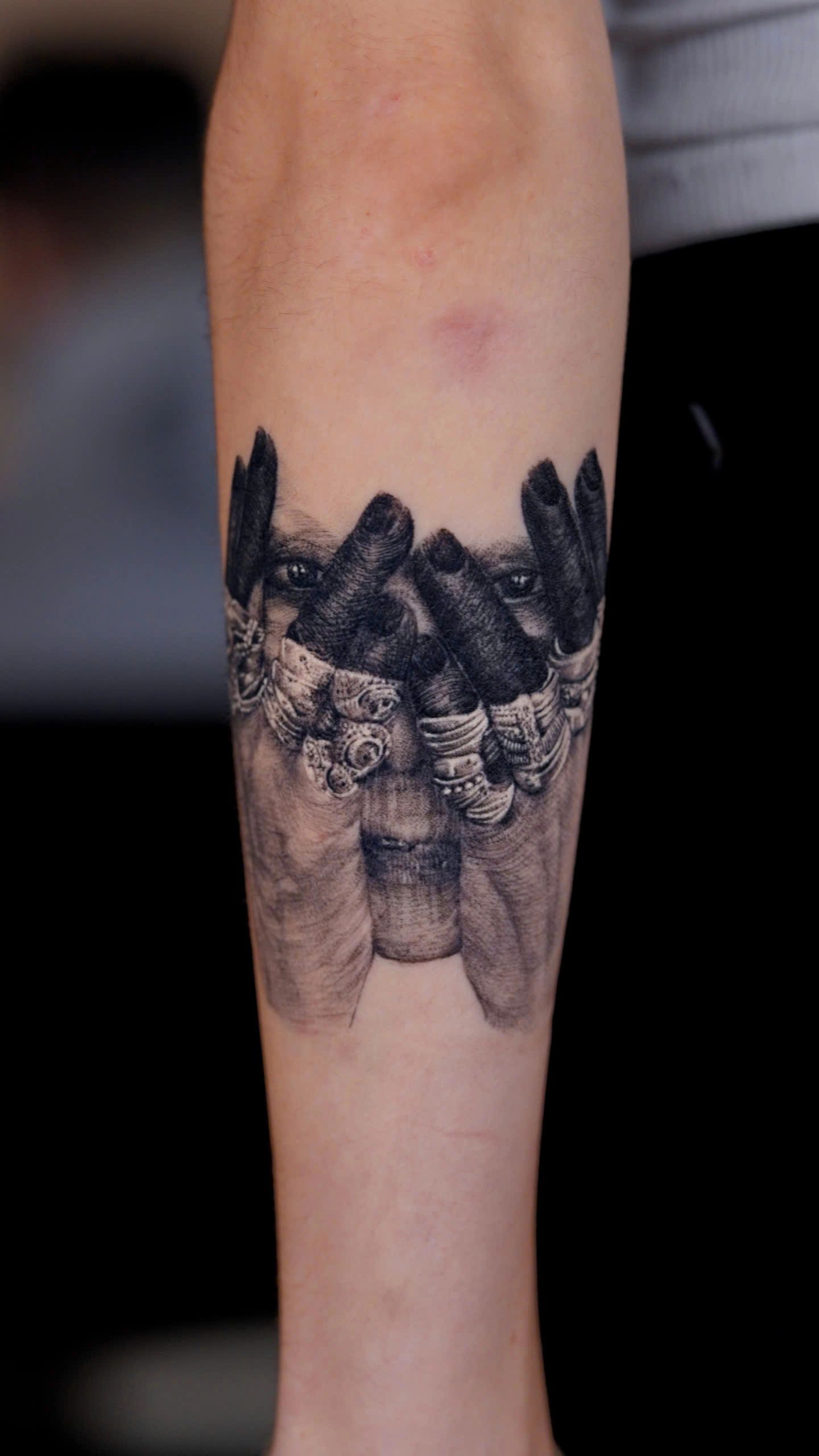
The Ultimate Guide to Realism Tattoos (2026) - Chapter 5 — The Science of Contrast - Why Some Realism Tattoos Stay Sharp While Others Turn Muddy



The Ultimate Guide to Realism Tattoos (2026)
Chapter 5
The Science of Contrast
Why Some Realism Tattoos Stay Sharp While Others Turn Muddy
Quick Answer
Contrast is the foundation of every successful realism tattoo. While many people focus on tiny details, experienced artists understand that the human eye recognises value contrast long before it notices texture. A tattoo with strong contrast will usually remain readable for years, whereas a tattoo built on weak tonal separation can gradually lose definition as the skin naturally softens over time.
Contrast Is More Important Than Detail
Ask someone why a realism tattoo looks impressive and they'll often answer:
"Because it has so much detail."
Professional artists usually disagree.
Detail attracts attention.
Contrast creates realism.
Without clear separation between light and dark, even the most technically detailed tattoo appears flat. Conversely, a tattoo with excellent value structure can feel remarkably lifelike even when viewed from several metres away.
This is why experienced realism artists begin by planning the largest value relationships before thinking about individual textures.
They establish:
-
the darkest darks;
-
the brightest highlights;
-
the primary light source;
-
and the overall visual hierarchy.
Only after these foundations are established do they begin refining skin texture, hair, wrinkles, feathers, or fur.
Artist Insight
"If we removed every tiny detail from a realism tattoo but kept the values intact, you would still recognise the subject instantly. If we kept every detail but destroyed the values, the realism would disappear."
— Silver Ant Tattoo
Understanding Values
Artists often use the word value instead of colour.
Value simply refers to how light or dark something appears.
Imagine converting a colour photograph into black and white.
The colours disappear.
The values remain.
If the values are strong, the image still feels convincing.
If the values are weak, realism disappears—even if the original colours were beautiful.
This principle explains why Black & Grey Realism Tattoos can appear every bit as lifelike as colour realism.
Depth comes from values.
Not colour.
To explore this further, see our Black & Grey Realism Tattoo Guide (/tattoo-styles/black-grey-realism-tattoo).
The Three Levels of Contrast
Professional realism artists think about contrast on multiple levels.
1. Global Contrast
This is the overall separation between the darkest and lightest areas of the tattoo.
Global contrast determines whether the design remains readable from across a room.
2. Local Contrast
This refers to smaller transitions within individual objects.
Examples include:
-
wrinkles around the eyes;
-
muscle definition;
-
animal fur;
-
flower petals;
-
feathers.
Local contrast creates realism without overwhelming the composition.
3. Edge Contrast
Not every edge should be equally sharp.
Some transitions should appear crisp.
Others should almost disappear.
Artists often refer to these as:
-
Hard edges
-
Soft edges
-
Lost edges
Controlling these edge transitions helps guide the viewer's attention naturally through the design.
Did You Know?
Many beginners believe realism improves by making every edge sharper.
Professional artists deliberately soften many edges because the human eye naturally focuses on areas with the greatest contrast.
By controlling edge sharpness, artists control where the viewer looks first.
Why Tattoos Become Muddy
"Muddy" is one of the most common words used to describe realism tattoos that have lost clarity.
But what actually causes it?
Contrary to popular belief, muddy tattoos are not always the result of poor ink.
More often, they result from design decisions made before tattooing even began.
Common causes include:
-
insufficient value separation;
-
excessive micro-detail packed into a small area;
-
poor use of negative space;
-
weak focal points;
-
inconsistent lighting;
-
overcrowded compositions.
As tattoos naturally soften during healing and ageing, these weaknesses become increasingly visible.
Strong design compensates for biological change.
Weak design exaggerates it.
If you're interested in the role healing plays in this process, our Tattoo Healing Guide (/tattoo-guides/tattoo-healing) explains how tattoos settle during the months following your appointment.
Scientific Note
Although tattoo pigment remains remarkably stable within the dermis, the skin itself continues to change throughout life. Natural collagen remodelling, ultraviolet exposure, and ageing gradually soften transitions, making strong initial contrast essential for long-term readability.
Further Reading
-
American Academy of Dermatology — https://www.aad.org
-
National Library of Medicine (PubMed) — https://pubmed.ncbi.nlm.nih.gov
Why Negative Space Protects Contrast
Contrast is not created by black ink alone.
Sometimes contrast is created by leaving skin untouched.
Negative space separates visual elements, allowing the eye to distinguish one form from another.
Without sufficient negative space, shadows merge together.
Details compete.
Depth disappears.
Professional realism artists understand that every square centimetre of untouched skin contributes just as much to the final composition as the tattooed areas themselves.
This principle becomes particularly important in full sleeves, where multiple subjects must coexist without overwhelming one another. Learn more in our Tattoo Sleeve Design Guide (/tattoo-guides/tattoo-sleeve-guide).
Artist Note
One of the most common design revisions we make at Silver Ant Tattoo is reducing visual density.
Clients often worry that removing background elements will make the tattoo feel incomplete.
In practice, simplifying the composition almost always makes the main subject feel stronger.
Realism is not measured by how much ink fills the skin.
It is measured by how convincingly the subject occupies space.
Contrast Ages Better Than Detail
Perhaps the most important principle in realism tattooing is this:
Details fade. Contrast survives.
This doesn't mean details are unimportant.
It means details should always serve the larger value structure rather than replace it.
When artists prioritise contrast first and texture second, realism remains convincing even as the tattoo naturally evolves over time.
That is one reason experienced collectors often judge healed tattoos—not fresh ones—when evaluating an artist's portfolio.
Common Mistake
"More detail automatically creates a better realism tattoo."
Not necessarily.
Without strong value structure, additional detail often creates visual clutter rather than realism.
Professional artists know that every new detail must strengthen the overall composition—not compete with it.
Key Takeaways
✔ Contrast is the foundation of realism.
✔ Values create depth; details create texture.
✔ Strong global contrast helps tattoos remain readable for years.
✔ Negative space is essential for preserving clarity.
✔ A healed tattoo reveals the quality of the design far better than a fresh tattoo.
Continue Exploring
To better understand how these principles influence real-world tattoo projects, continue with:
-
Black & Grey Realism Tattoo →
/tattoo-styles/black-grey-realism-tattoo -
Color Realism Tattoo →
/tattoo-styles/color-realism-tattoo -
Tattoo Healing Guide →
/tattoo-guides/tattoo-healing -
Tattoo Sleeve Design Guide →
/tattoo-guides/tattoo-sleeve-guide -
Tattoo Design Process →
/tattoo-guides/tattoo-design-process
References & Further Reading
Art & Composition
-
The Metropolitan Museum of Art — https://www.metmuseum.org
-
Getty Museum — https://www.getty.edu
Skin & Healing
-
American Academy of Dermatology — https://www.aad.org
-
National Library of Medicine (PubMed) — https://pubmed.ncbi.nlm.nih.gov
Next Chapter
Chapter 6 — Black & Grey vs Color Realism: Which Style Is Right for You?