Image
21/07/2026 | by Silver Ant Tattoo

Black & Grey Realism Tattoo: The Complete Guide (2026) - Chapter 3 — The Science of Light and Shadow - Why Black & Grey Creates Depth Without Color

Black & Grey Realism Tattoos

Chapter 3

The Science of Light and Shadow

Why Black & Grey Creates Depth Without Color


Quick Answer

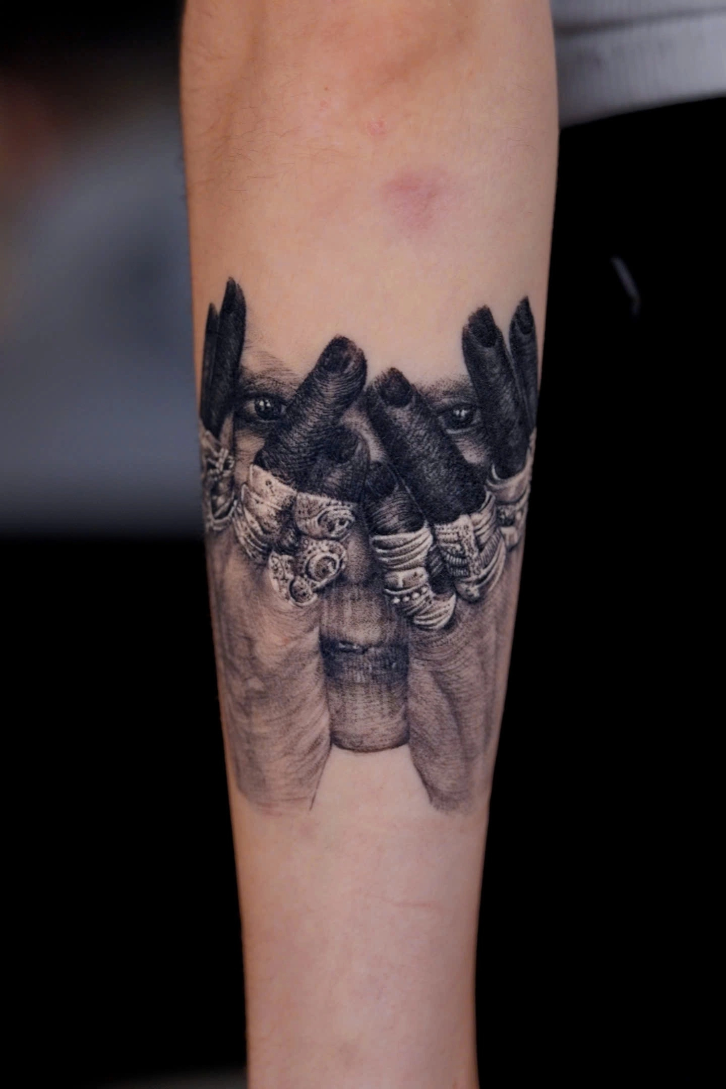
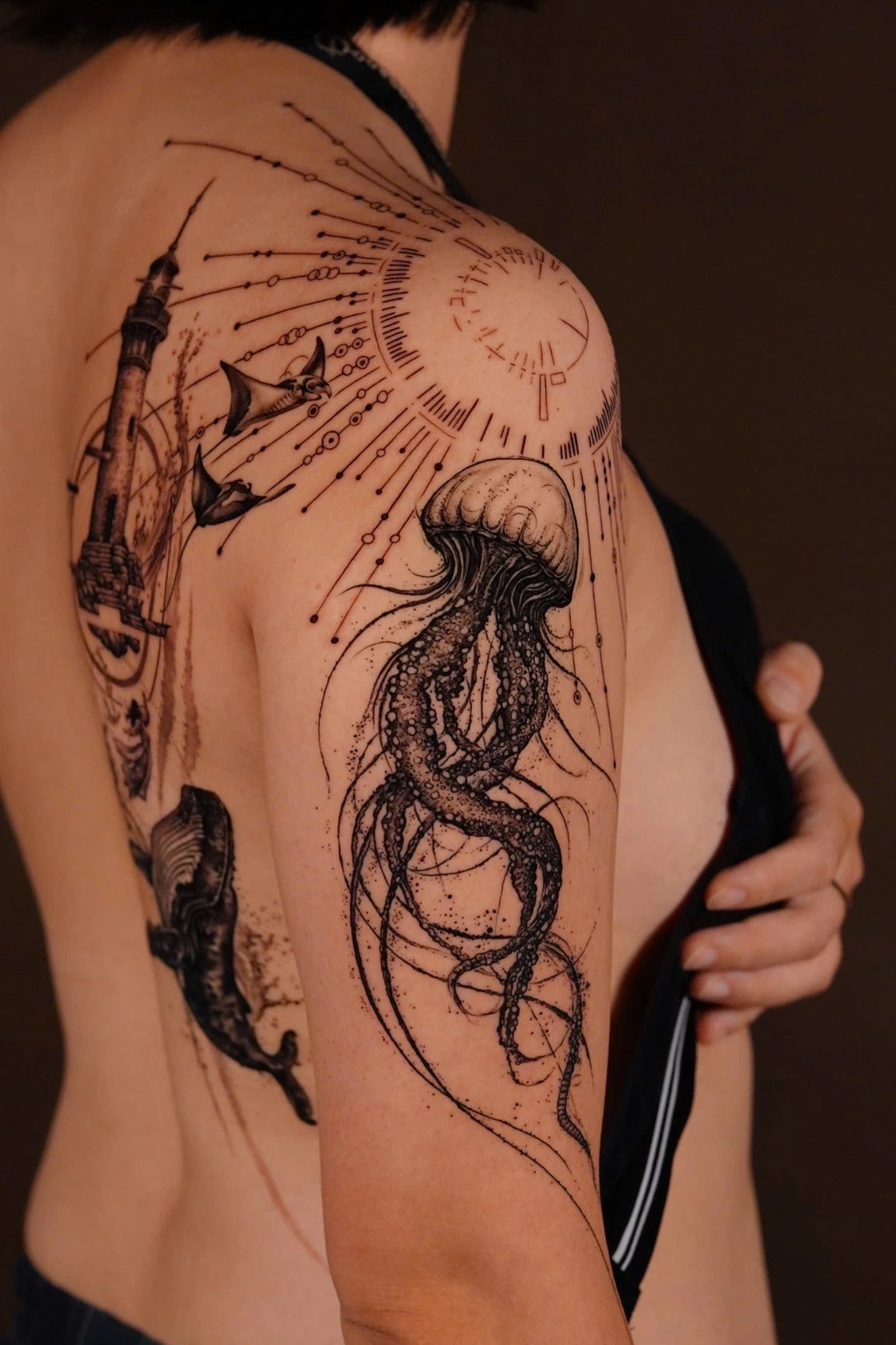
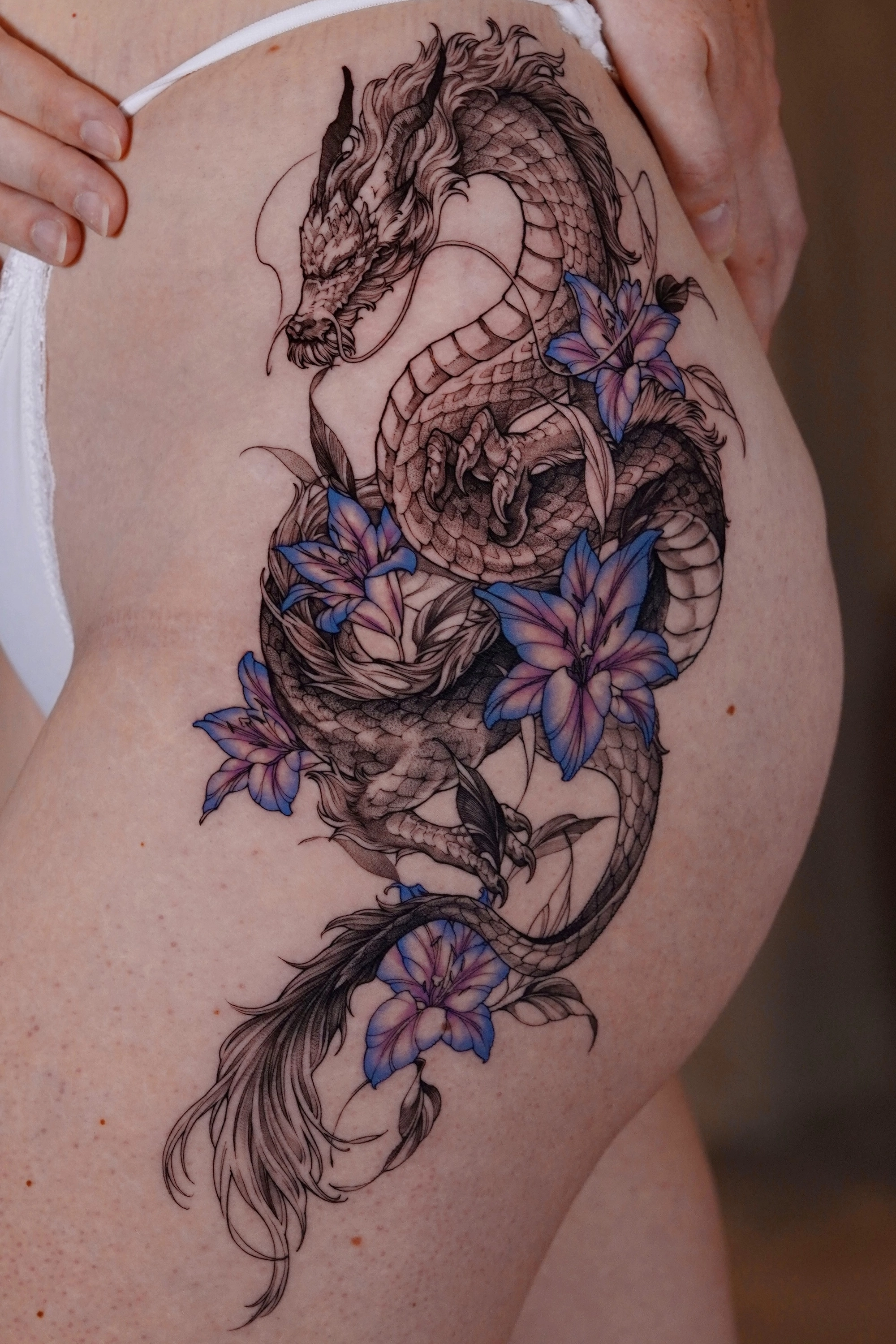
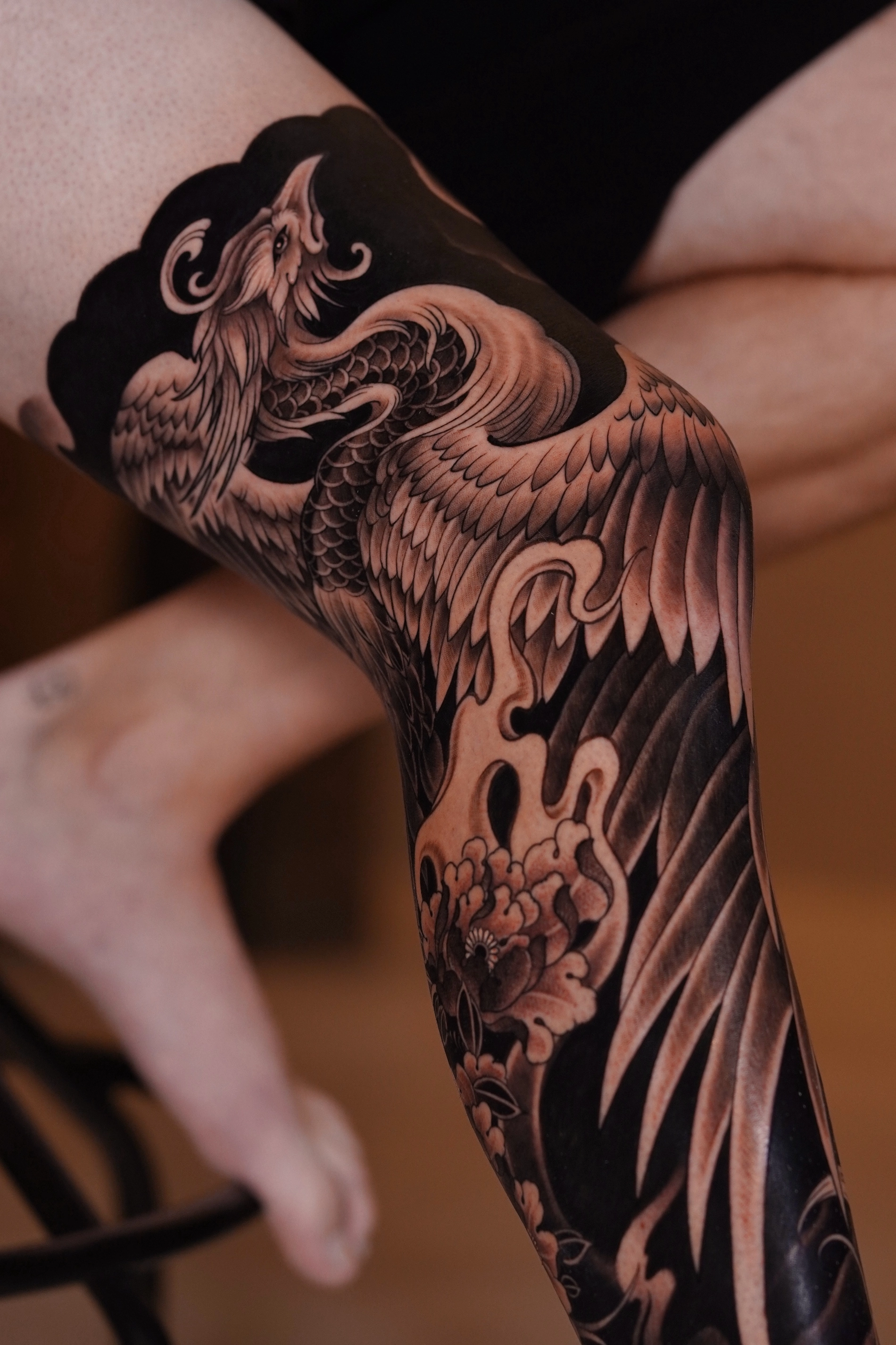
Black & Grey Realism creates the illusion of three-dimensional form not through colour, but through the careful control of light, shadow, contrast, and value. By recreating the way light naturally falls across an object, artists can make a flat tattoo appear remarkably lifelike.

In realism, the viewer doesn't perceive ink first.

They perceive light.


Your Brain Doesn't See Ink

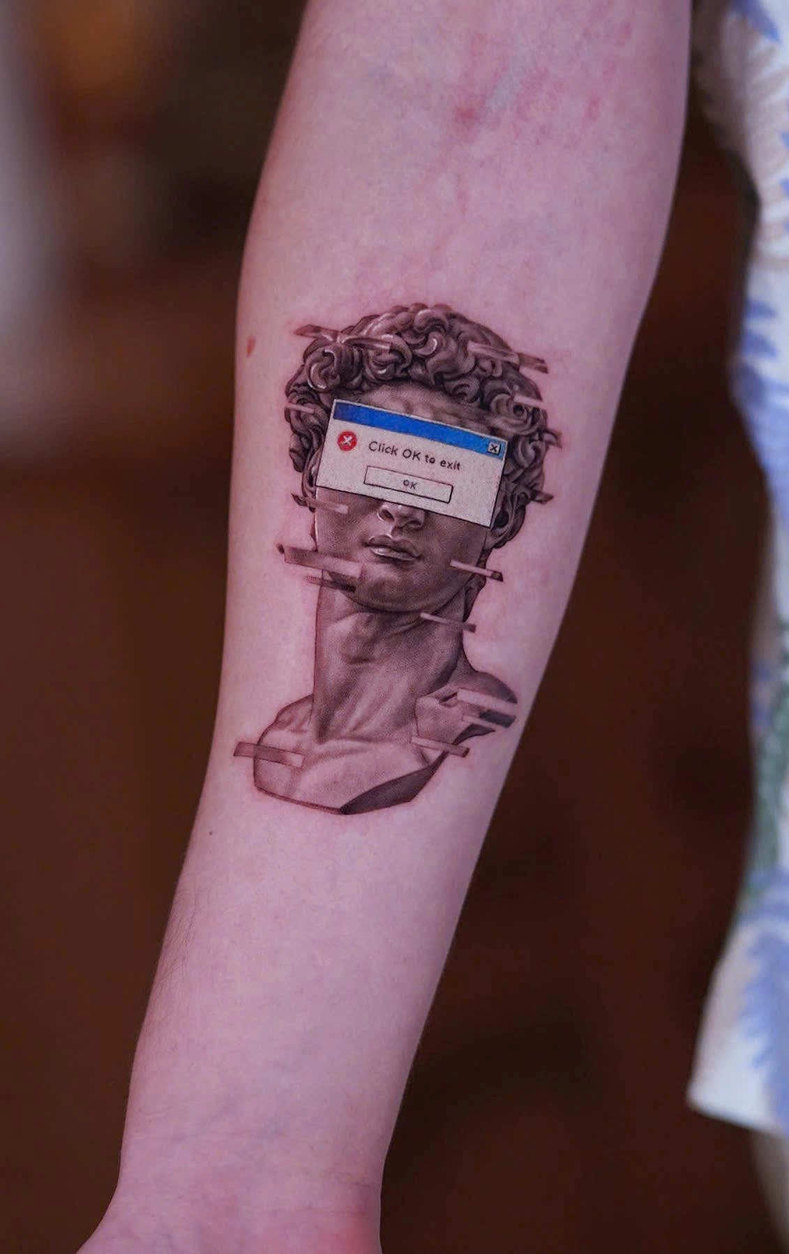
Imagine looking at a marble statue under bright afternoon sunlight.

Although the sculpture is made from a single material and a single colour, it still appears incredibly realistic.

You can immediately recognise:

  • its shape;

  • its depth;

  • its texture;

  • its weight.

Why?

Because your brain is interpreting light, not colour.

This same principle explains why black-and-white photography can still feel vivid and emotionally powerful.

Without colour, the eye naturally pays greater attention to brightness, shadow, and form.

Black & Grey Realism works because it recreates these visual relationships on skin.

The tattoo itself remains flat.

The illusion exists entirely inside the viewer's brain.


Artist Insight

"People often think realism comes from detail. In reality, realism comes from believable lighting. Get the light right, and the brain fills in the rest."

— Silver Ant Tattoo

Understanding Value

If colour disappeared from the world tomorrow, you would still recognise most objects.

That's because the human visual system relies heavily on value—the relative lightness or darkness of different areas.

Artists often think in terms of five basic value groups:

  • Highlight

  • Light

  • Mid-tone

  • Shadow

  • Deep Shadow

Every realistic tattoo is essentially an arrangement of these values.

A portrait.

A tiger.

A skull.

A rose.

Although the subjects differ dramatically, the underlying visual language remains the same.

The stronger the value structure, the more convincing the illusion of depth becomes.


Did You Know?

Many realism artists temporarily remove colour from their digital references while designing.

Viewing an image in grayscale makes it easier to judge whether the lighting and composition are strong enough before any tattooing begins.


Light Describes Form

Imagine two perfectly identical spheres.

One is illuminated from above.

The other from below.

Even though their shape hasn't changed, they immediately feel different.

The first appears natural.

The second feels dramatic—even unsettling.

Nothing changed except the direction of light.

This demonstrates one of the most important principles in realism:

Lighting tells the brain how to interpret form.

Professional tattoo artists therefore make conscious decisions about:

  • the direction of the light source;

  • the intensity of the light;

  • the softness of the shadows;

  • where reflections appear;

  • how different surfaces respond to light.

These choices shape not only realism, but also emotion.


Why Shadows Matter More Than Details

Many beginners spend most of their attention drawing eyelashes, wrinkles, fur, or tiny textures.

Experienced realism artists often begin somewhere else:

The shadows.

Without believable shadows:

  • a face loses its structure;

  • an animal appears flat;

  • stone looks like plastic;

  • metal loses its shine.

Texture should support form.

It should never replace it.

One well-designed shadow usually contributes more to realism than hundreds of unnecessary details.


Scientific Note

The visual cortex processes edges and luminance differences extremely quickly. Strong value transitions help the brain identify shape and depth even when fine texture is absent, explaining why high-contrast images often remain recognisable from a distance.

Further Reading

  • National Eye Institute

  • National Library of Medicine (PubMed)


Negative Space Is Part of the Lighting

When people think about tattooing, they usually think about the ink being added.

Professional artists also think carefully about the skin they intentionally leave untouched.

Untattooed skin acts as the brightest value in the entire composition.

It becomes:

  • reflected light;

  • atmospheric separation;

  • highlights;

  • breathing room.

Without these untouched areas, shadows become muddy and the tattoo begins to lose clarity.

Negative space is not empty.

It is an active design element.


Artist Note

One of the most common adjustments we make during the design process is removing unnecessary shading.

Clients sometimes assume more ink equals more realism.

In practice, carefully preserving highlights often creates a stronger illusion than adding darker shadows everywhere.

Knowing where not to tattoo is just as important as knowing where to tattoo.


Building Depth Layer by Layer

Professional Black & Grey artists rarely jump directly to the darkest values.

Instead, they gradually build contrast.

A typical progression looks like this:

  1. Establish the overall composition.

  2. Identify the primary light source.

  3. Block in the largest shadow shapes.

  4. Develop mid-tones.

  5. Refine textures.

  6. Reinforce the darkest accents.

  7. Preserve the brightest highlights.

This approach mirrors the workflow of many classical painters and helps maintain balance throughout the tattoo.

Rather than chasing detail too early, artists first establish a solid foundation of light and shadow.


Why Black & Grey Often Feels More Dramatic

Colour naturally attracts attention.

Black & Grey directs attention differently.

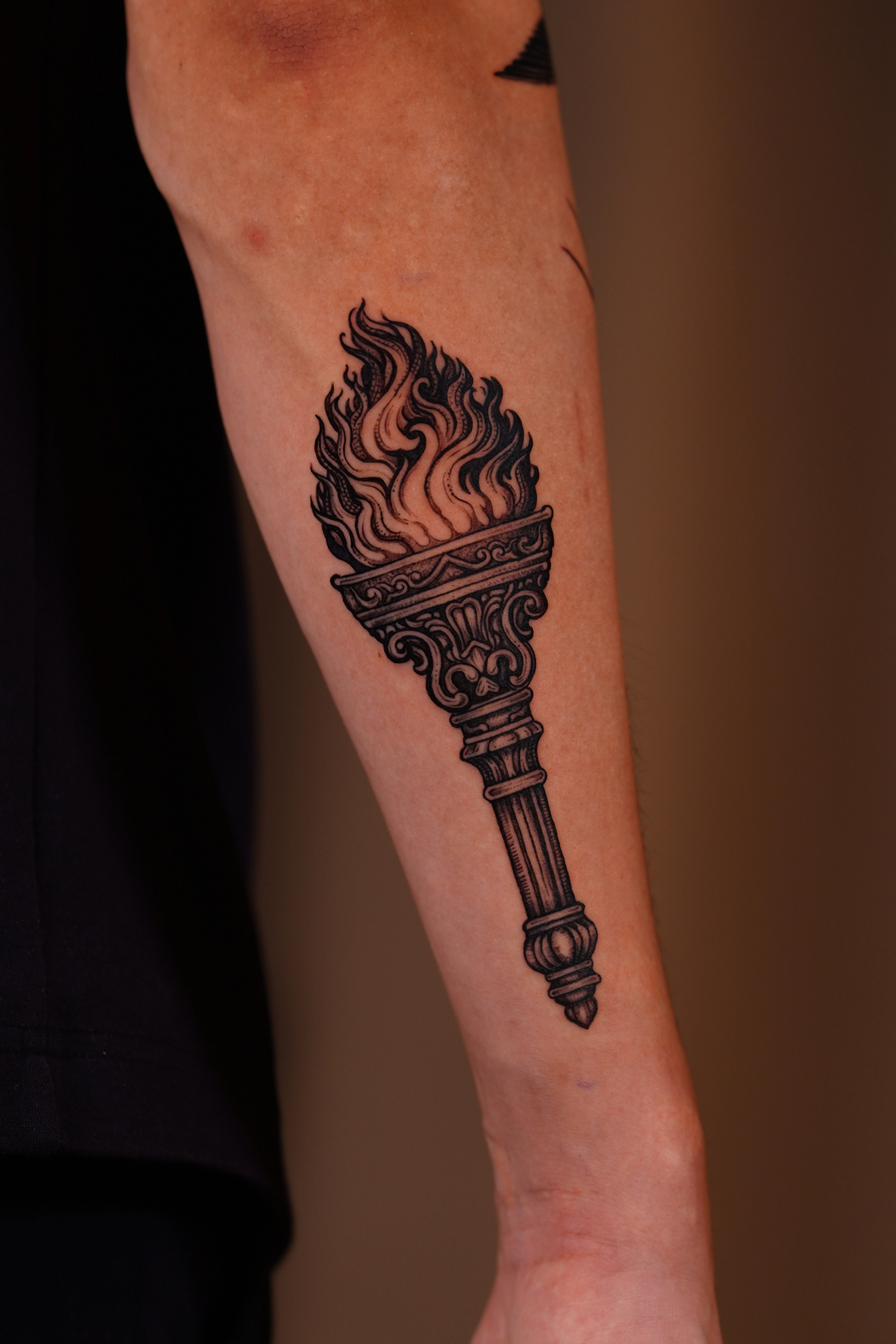
Without competing hues, the eye focuses entirely on:

  • contrast;

  • composition;

  • lighting;

  • expression;

  • atmosphere.

This often gives Black & Grey tattoos a cinematic quality.

Many collectors describe the style as timeless because it relies on universal visual principles rather than changing colour trends.

Whether the subject is a portrait, a wolf, or a marble sculpture, strong lighting continues to communicate depth in the same way.


Common Misconception

"More black ink automatically creates more depth."

Depth comes from relationships, not darkness alone.

If every area is equally dark, nothing stands out.

Professional realism depends on balancing light and shadow—not simply increasing contrast everywhere.

The brightest highlight is meaningful only because it exists beside a believable shadow.


Key Takeaways

  • Black & Grey Realism creates depth through value rather than colour.

  • The brain recognises light and shadow before it interprets fine detail.

  • Strong lighting is often more important than complex textures.

  • Negative space functions as an essential part of the lighting design.

  • Realistic tattoos are built by controlling relationships between values, not by making everything darker.


Continue Exploring

The next chapter explains how artists transform these lighting principles into convincing portraits that capture both likeness and personality.

You may also enjoy:

  • The Ultimate Guide to Realism Tattoos

  • The Science of Contrast

  • Tattoo Design Process

  • Tattoo Healing Guide


References & Further Reading

Vision & Perception

  • National Eye Institute

  • National Library of Medicine (PubMed)

Classical Art

  • The Metropolitan Museum of Art

  • Getty Museum


Next Chapter

Chapter 4 — Portrait Tattoos: Capturing Identity, Emotion, and Likeness in Black & Grey